The Hidden Message In The Baskin-Robbins Logo That We Keep Looking Past
Many ice cream chains exist, but few have been around as long as Baskin-Robbins. The first store was opened in 1945 by Irv Robbins and his brother-in-law Burt Baskin. The pair began franchising just three years later in 1948. At this point, both Carvel and Dairy Queen had already been open for several years — Carvel was founded in 1934, and Dairy Queen in 1940. But Baskin-Robbins still managed to stand out from its competitors, and for a very good reason.
Before Baskin-Robbins came along, ice cream often times came in only three standard flavors: chocolate, vanilla, and strawberry. Baskin and Robbins loved ice cream enough to open their own ice cream parlor, but to set themselves apart they had to do something that would get customers talking. In 1945, that something was to release more than three flavors. The two businessmen then decided on 31 flavors, one for each day of the month so people would continue coming back to the store.
The logo didn't have a hidden message until 2006
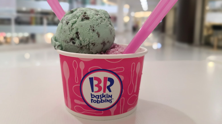
Since its 31 flavors were Baskin-Robbins' biggest selling point, the ice cream shop's first logo was simply a big "31" with Baskin-Robbins Ice Cream written above and below it in small letters. For many years, the prominent 31 brought in countless customers who would continue to associate Baskin-Robbins with its extensive flavor offerings. In 1980, the logo underwent its first change, switching the background color from green to pink, and changing Baskin-Robbins Ice Cream to simply Baskin-Robbins below the number. In 1991, the brand decided to bring the name front and center, but with the 31 still clearly visible.
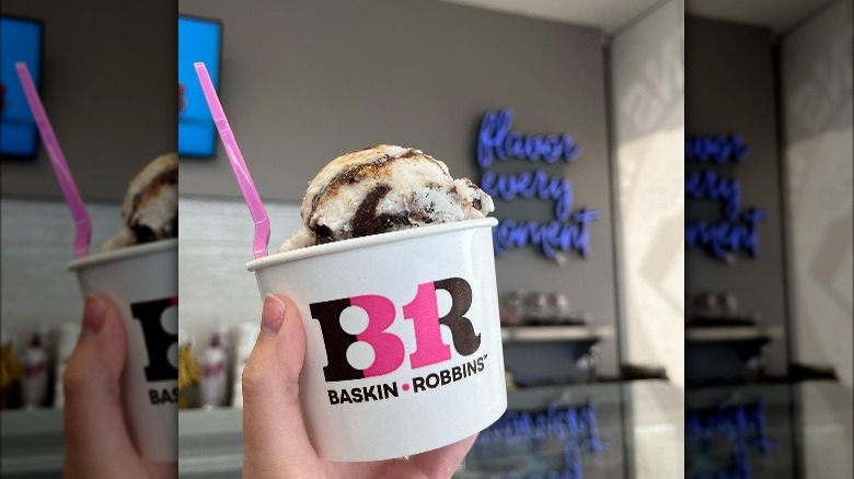
By 2006, however, Baskin-Robbins was very well-established and many other ice cream chains offered more than three flavors. The company, therefore, didn't have to push its number of flavors as hard and decided to revise its logo once again. The updated logo instead featured the number 31 cleverly disguised in the letters B and R of Baskin-Robbins. Thus, the company was able to modernize its logo without completely eliminating the number that originally made it a household name.
Will Baskin-Robbins ever retire the 31 in the logo?
If you look at the different Baskin-Robbins logos throughout the years, the most obvious change is the placement of the 31. As the years go by, it becomes less and less obvious, which makes sense considering Baskin-Robbins has now offered over 1,400 different flavors. And while you might assume that Baskin-Robbins will eventually retire the 31 in its logo altogether, it doesn't seem like that's the case — at least, not for now.
In 2022, Baskin-Robbins updated its logo yet again, changing its font and color in favor of one that more closely resembles the original. Instead of the bright blue and pink that was adopted in 1991, it's back to the brown and pink from its 1980 iteration. Although the 31 is still disguised in the BR of Baskin-Robbins, it's definitely still there. When designing the new logo, Baskin-Robbins wanted to make sure to modernize the logo, while also retaining the same sense of nostalgia older generations remember when shopping there. So even though the 31 will probably never be the focal point of the logo, it's likely that Baskin-Robbins will always have it hidden in a nod to its history.


