9 Artsy Restaurant Menus
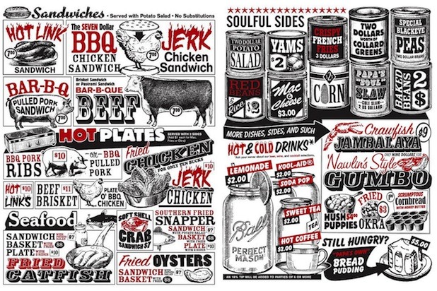
Someone definitely put some soul into these hand-drawn renderings of Papa's Soul Food menu offerings — which are "So good they'll make you slap yo' Mama." The menu embodies the down-home, vintage vibe of this Oregon restaurant while making you crave everything on it (how could you not?). If the smell of deep-fried chicken doesn't draw you in, the jazzy black-white-and-red menu definitely will.
RJ Grunts — Chicago
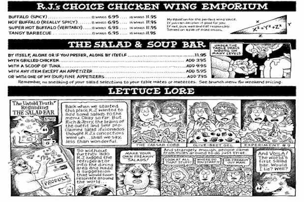
This Chicago spot has been around for 40 years, and still exudes the funky, carefree ethos of the 1970s, right down to its sprawling, chuckle-inducing menu. It's "as much fun to eat your way through as it is to read," with comic strips, witty illustrations, and side-notes scattered throughout. What it lacks in adherence to traditional design tropes, it more than makes up for in sheer spiritedness.
Eleven Madison Park — New York City
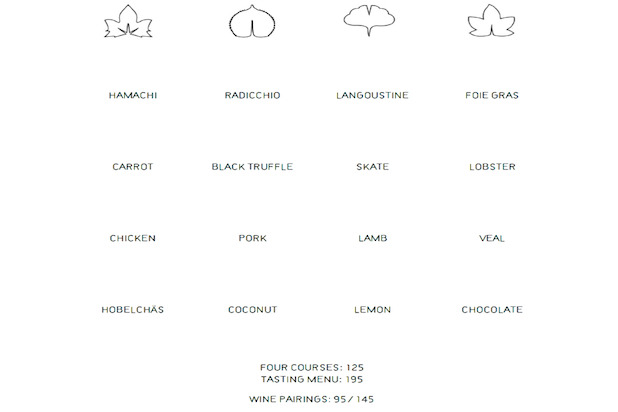
Flashy or avant-garde styles aren't always the key to a good-looking, well-designed menu. Eleven Madison Park's menu is the perfect example of a well-executed minimalist approach — the supremely simplified menu features just 28 words total and 16 principal food ingredients from which to choose, along with small, elegant line-drawings on a plain white square. It's meant to create a crisp, simple, and sophisticated experience, and it achieves just that, leaving the spotlight to the flavors.
Oregano's — Arizona
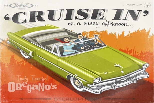
This Arizona pizza chain is a friendly neighborhood joint with a spunky '50s vibe. So the menu, designed by Trapdoor Studio and stitched on the back of '50s-style vintage album covers, completes the experience perfectly.
Tap — Atlanta
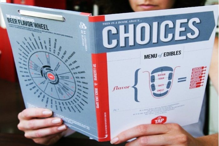
Tap's menu is an innovative "Book of Choices" held together by a binder clip that allows you to easily swap out menu pages. On the back is a "Beer Flavor Wheel," which whets the palate while also managing to be informative and easy to read. Inside the book, each offering is clearly diagrammed in sleek charts and infographics. Designed by John Turner, the menu is put together with just the right amount of whimsy for this relaxed gastropub atmosphere.
Donna — New York City
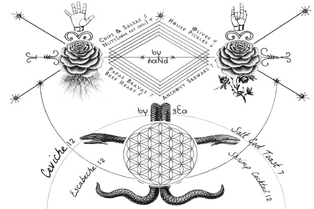
This rustic, Central American-inspired bar under the Williamsburg Bridge in Brooklyn prides itself on an "elegantly dilapidated" aesthetic. The menu itself is elegant, with a twist of exactly the sort of edge found in the patrons the bar draws — it's slightly Art-Deco, slightly supernatural, and definitely beautiful.
Isa — New York City
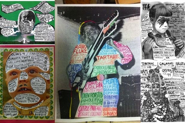
Despite its relatively simple rustic, wood-hewn appearance, Isa revels in the peculiar. From the architectural fixation on triangles right down to the psychedelic, avant-garde menus — whose contents and design change nightly — the restaurant pairs a back-to-basics ethos with a whimsical approach. Owner Taavo Somer touts Isa as "modern primitive," and the menu art captures his creative pairings of simple ingredients with the sort of eyebrow-raising design that underscores all of Isa.
Hot Diggity — Philadelphia
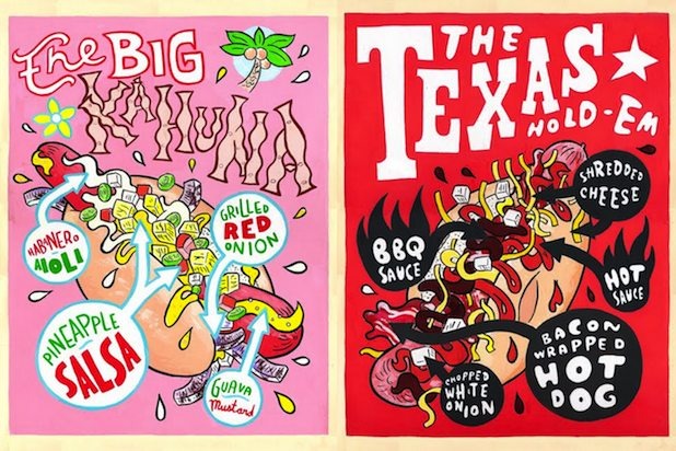
The menu here looks more like a series of whacky comic-book covers than a display of hot dog choices. It's perfect for the playful vibe of this Philadelphia hot dog shack, where each of a nearly endless array of U.S-city-themed hot dogs is given its own personality through individual, colorful painted illustrations by Hawk Krall.
Alinea — Chicago
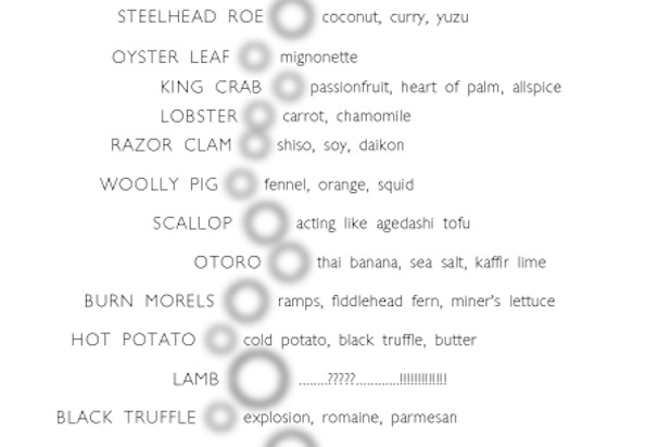
Owner/Chef Grant Achatz has boiled menu design down to a science — one nearly as exact as that with which he approaches food at his famed molecular gastronomy restaurant. Alinea uses a cascade of soft gray bubbles in various sizes and positions to map its dishes: the farther right, the more sweet; the larger size, the bigger the dish. It's based in pure data, straightforward, and logical. Except for the fact that you only get the menu after the meal, as a keepsake.
