Seriously, Why Are Soda Cans Shaped Like Cylinders?
When it comes to beverage fun facts, perhaps you're familiar with the fizzy origins of soda, but do you know why it comes in cylindrical cans? Determining how the packaging was designed for a product is something most consumers probably don't deeply consider. After all, most people who enjoy soda today have never experienced a world in which this package wasn't the primary option (an outcome perhaps in part thanks to Coca-cola cans, which were first created out of wartime necessity).
The soda can's development was in part inspired by why other shapes weren't up for the job. The two other main options — spheres and cuboids (or circles and squares, from a 2D perspective) — each had enough downsides that they were ruled out. Enter the cylinder, which had some of the same strengths as the other two options, along with it's own upsides.
For those engineers ideating on how to best sell and serve soda, there seems to have been an evaluation of those three main entries, and understanding how they arrived at the iconic can shape is a little bit of an engineering Goldilocks tale.
Considerations and contenders
There are many considerations when creating food packaging. From preservation of quality, to convenience (both for producer and consumer), economics of transportation, ease of sale, and of course, aesthetics. The considerations for soda also include the pressure of carbonation (which is different from, say, juice or water).
The sphere had some benefits in terms of even distribution of pressure, and a lot less susceptibility to damage thanks to the fact that there were no corners or edges. It also used the least amount of material, which would be good news for the bottom line (making them also lighter and less expensive to transport). The bad news? Well, for one thing, a sphere of liquid isn't going to sit still on the table when you set it down, or stack up beautifully for a grocery store display. Additionally, when filling a shipping box with balls, there's an awful lot of wasted space in between (almost a full ¼ of the box's volume).
On the opposite end of the spectrum, consider the cuboid, which can't be beat in terms of packaging (there is literally zero wasted space, as they can stack neatly like building blocks). They're also not going anywhere when you set them down on a table or a store shelf, because the bottom is conveniently flat and stable. Unfortunately, corners, protrusions, and edges are subject to vulnerability. So, another no-go.
The clear winner
The cylinder? Now that was just right for soda — a hybrid model between the sphere and the cuboid. It reached a happy medium in terms of its ability to be stacked and also packed more efficiently (only about 10% of a shipping package of cylinders will be empty), and lacked the severe vulnerability of the edgy cuboid. Another consideration was ease of production, and in that respect, the cylinder was a clear winner in its quick and innovative process.
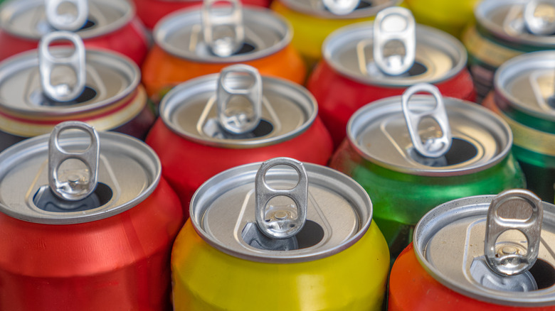
Of course, there are so many additional awe-inspiring decisions that make the can we know today. It needed a lining that can stand up to carbonic acid (which could corrode the inside walls), the pull-tab that makes it simple for us to open without an extra tool, and the seam that keeps the whole thing stitched together. Soda can engineers didn't rest on their laurels either, they've continued to innovate, improve, and streamline (which is part of the reason Hawaiian soda cans look so different) as technology has become available. The vessel as we know it today is the result of evaluation and compromise, ingenuity and evolution.


