Jell-O Is Revamping Its Look For The First Time In A Decade
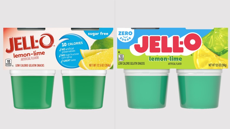
Jell-O has always seemed like a nostalgic treat, and its packaging has made it feel that way, too. But now, the jiggly dessert is rebranding with a whole new logo and look. It's sleeker than the brand's previous packaging, and it finally brings the gelatin and pudding maker into this decade — it's been a full 10 years since Jell-O updated its appearance, according to a press release shared with Daily Meal.
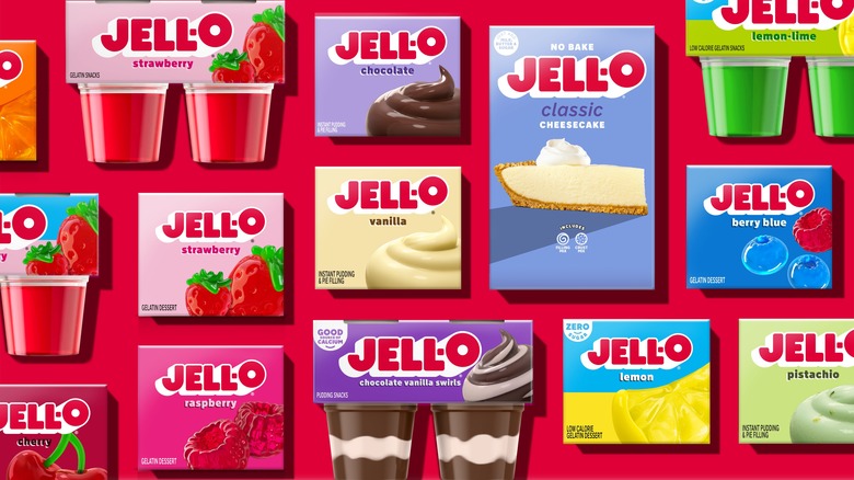
Jell-O, whose parent company is Kraft Heinz, rebranded by changing its logo from sharp-edged block letters to thick, bubble-style letters, possibly to give them a more "jiggly" feel in line with its products. The brand's pudding and gelatin packaging remains in its typical square box, but the flavors are coupled with animated-looking designs to note the type, whether strawberry, lemon, vanilla, or one of its many other flavors. Beyond that, the company's packaging features many colorful fonts, inviting a wide array of colors to the packaging, which differs depending on the Jell-O product.
Jell-O's new branding makes it even more noticeable
One thing the company made sure to do was put even more into its logo to make it stand out better on the packaging. The brand says it wanted to put "more emphasis" on the "O" in Jell-O, having the letter hover slightly above the other four letters to help make it more noticeable.
"As 'America's Most Famous Dessert,' we aim to transcend generations and want to continue bringing our customers on a never-ending flavor journey," Kristina Hannant, associate director of desserts at Kraft Heinz, said in a press release, per Today.
Since the name was first trademarked back in 1897, Jell-O's packaging and logo have changed about 10 times, or roughly once every dozen years. This change marks yet another rebrand from parent company Kraft Heinz; the company has revamped 18 of its products in the last three years, including Oscar Mayer and Kraft Mac & Cheese. Customers should see the new Jell-O packaging in stores in July 2023.

