Gushers' New Packaging Has Nostalgia In Mind
In April, a TikTok influencer posted a video redesigning Gushers' logo, saying General Mills asked them user to help update it. After calling the old design busy, confusing, and "so 2004," she drew a rainbow-gradient oval above the hand-written word "Gushers" and the tagline "nice." While this might seem like just a silly gag, the TikTok was actually part of a paid partnership, and the official Gushers account even commented, "you're making some great points."
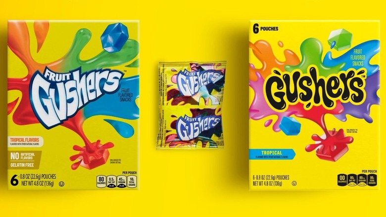
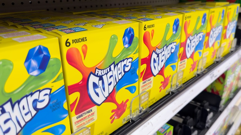
Now, as April draws to a close, Gushers has revealed that it did, in fact, redesign its logo to make it more contemporary, as reported by The Takeout. The term "fruit" has been dropped from the logo (perhaps trying to avoid any criticism for false-advertising healthiness), and the font is no longer angular. Instead, it's rounded and squished with little droplets apparently spraying off the letters — like a Gusher when you bite it. The candy itself is still visible around the edges, as are the (now even rounder) puddles of juice nearby.
While this is surely an appeal to modern aesthetics, the minds behind this redesign still went out of their way to honor Gushers' nostalgic past.
What makes Gushers so nostalgic?
When it comes to fruit snack brands, General Mills is one of the sweetest — at least, it can feel that way to adults reminiscing about their childhood. The company began experimenting with fruit snacks all the way back in 1975, and Fruit Roll-Ups emerged onto the scene by the time the '80s rolled around. However, fruit snacks hit their stride in the 1990s, which saw the introduction of Fruit by the Foot and Gushers.
The latter was an instant hit, and it featured yellow packaging with the word "Gushers" surrounded by candy and juice, just like this newest redesign does. The candy did partnerships back then, too, teaming up with "Goosebumps," "Jurassic Park," and Nickelodeon to make a splash in the hearts of countless kids.
"It felt particularly special and incredibly nostalgic to be able to reimagine these brands for today's teens," an exec at the brand design agency behind the said in a statement (via The Dieline). While they wanted to keep Gushers relevant, the team had also grown up with this candy and wished to keep that beloved legacy alive. The design and color palette are essentially the same, just in an altered style. The idea wasn't to replace nostalgia; it was to get new youths invested in it.