Pepsi Is Changing Up Its Look In A Major Way
If you're hearing the instantly recognizable "psst" of a cracked soda, there's a good chance that the can currently chilling your hand is either a Coke or a Pepsi. For more than a century, these two beverage behemoths have been engaged in the Cola Wars, a branding battle that fundamentally reshaped the face of American advertising.
Coke will always have one considerable advantage in these beverage battles: It is the original cola. As such, Pepsi has been forced to combat Coke's history by employing a more aggressive marketing strategy than its rival. For example, Pepsi was the sponsor of the Super Bowl Halftime Show for a decade and only relinquished ownership of the coveted marketing slot to Apple Music for 2023's Super Bowl LVII. You may also recognize Pepsi advertisements like the delightful Michael Bublé Super Bowl commercial for Bubly or the company's much-maligned Kendall Jenner social activism advertisement faux pas.
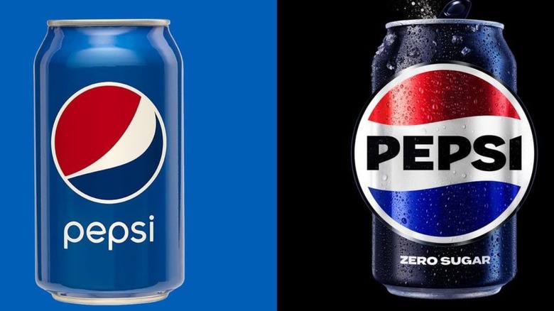
Recently, Pepsi announced that it would be changing the trademark look and logo of its classic can completely, which may prove to be the company's boldest-ever brand move.
Is Pepsi's new logo a marketing masterstroke or a maximalist misstep?
The Pepsi logo has gone through countless changes over the years. 1950 consumers saw the first spherical, tricolored version of the logo, and the most modern iteration, a minimized circle rife with secret messages and meanings that cost the company $1 million to design.
After 15 years, Pepsi is once again shaking up its look. The ubiquitous blue Pepsi can is in the process of being replaced by a new, darker model that is meant to make the logo itself, which has had its colors and dimensions altered, pop in a potential customer's eye.
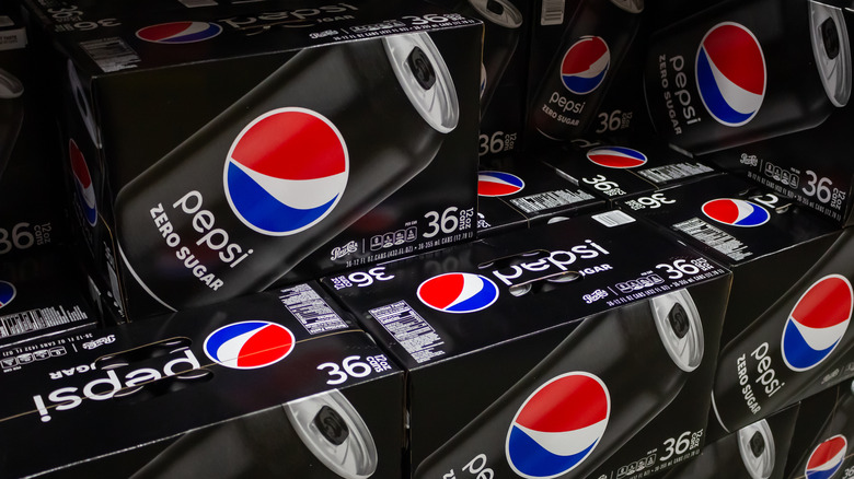
The new Pepsi cans bear slight resemblance to the current packaging used for Pepsi Zero Sugar. And these visual similarities are intentional. Pepsi wants the new marketing campaign to highlight the sugar-free soda — it's begun to overtake classic Pepsi, at least in terms of stimulating consumer growth. The new can has also taken the lowercase pepsi from its place underneath the logo and placed a bold, all-caps PEPSI inside the newly enlarged center white stripe.

