Where On Earth Are The Windows In Grocery Stores?
Don't take grocery stores for granted, even if it seems like some of the bigger chains have become more routine than other less frequented shopping experiences. No matter what you call it, there is a difference between a grocery store and a supermarket, and Americans spend $766 billion dollars every year at these stores.
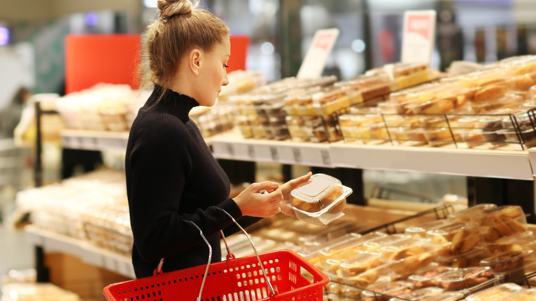
With that much money at stake, it's probably no surprise that the store design is precisely thought out. According to StoreTraffic, a bakery or floral department near a grocery store entrance will have a huge impact on sales. The flowers offer a visually interesting shock to the eyes that indicate you've entered a bright, fresh space. Those flowers and bakeries also engage our sense of smell. Those pleasant sensory experiences encourage more spending. In fact, bakery items have some of the biggest margins in the entire store.
From there, there are various store layouts that can appeal to different shopping styles. In a separate article, StoreTraffic explains the psychology of using a grid pattern to shuttle shoppers down aisles, versus the maximum exposure to products that a single loop creates. Or, a free-flowing design that encourages a wandering customer to make impulsive purchases.
The many reasons you don't find windows in grocery stores
The typical store's lack of windows is another purposeful ploy that affects our purchasing (per The Healthy). Grocery stores want you to see their space as a unique, distinct place. Those flowers at the entrance are probably in stark contrast to the parking lot you've just walked through. Without windows, shoppers can't worry about the weather or any distractions that can be seen through a window. And no distractions add to the many reasons you're spending more at the grocery store.
In addition, and more importantly, sunlight isn't good for most products in grocery stores. Essentially, a grocery store is just a massive pantry. Just like at home, dried goods don't like sunlight. FoodSafety Magazine explains how sunlight will spur oxidation, which can alter foods' appearance and nutrition.
Furthermore, windows take up valuable shelving space for more products. As Vox explains, that shelving space is sold to food manufacturers in the form of slotting fees. Every inch of shelf space is incredibly valuable. Plus, skipping windows saves on construction, heating, and cooling costs. Not to mention there are fewer points of entry to account for in terms of security.
What else are grocery stores doing to affect our shopping psychology?
StoreTraffic specialties in retail design — an important field. Even as our shopping habits turn to the internet, they cite that 82% of shopping decisions are still made in brick-and-mortar stores. So, there's no point in a grocery shopping experience that hasn't been thought through to entice impulsive purchases beyond your grocery list.
Shoppers are most likely to notice signage within the first 15 feet and tend to turn right more than left, the outlet claims. This is why you can expect a display to the right and within just a few feet of entering the store.
The color of that signage might say just as much to a shopper as the words. Every color evokes different emotions. Red, orange, black, and dark blue hues inspire impulsive purchases by inspiring urgency, aggression, power, and trust, respectively. While purple and green say "budget" by evoking feelings of soothing wealth, lighter shades of blue and pink drive traditional buyers.
If you find yourself overwhelmed by this newfound information, you may want to try a dark grocery store, instead.


