How Target's Store Layout Secretly Lures You In
We may receive a commission on purchases made from links.
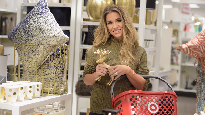
Picture this: You walk into Target with a gift registry list in hand. You already know the items you're going to buy, so you figure you'll be in and out in 15 minutes. Thirty minutes later, you've walked around the entire store and have $75 worth of other items you didn't plan on buying — the Raw Sugar hand wash, the pack of unicorn straws for the kiddos, and the fresh Panera soups across from the cosmetics aisles.
It happens to the best of us. We enter the store needing just a few items, but we leave with a lot more. After all, Target offers a lot of really neat stuff. Urban Dictionary refers to this phenomenon as The Target Effect. If it makes you feel any better, there's actually a reason that so many customers fall into this shopping trap.
Target stores are strategically designed to lure in customers, which not only gets them to spend more time inside but also to buy more merchandise than they were planning. Here's how the bullseye retail giant does it.
Target stores are designed to appeal to your senses
When you enter a Target store, you're typically greeted by one or more things, depending on which entrance you choose. It might be a greeter with a smile, a colorful display of the latest seasonal items, the wafting aroma of Starbucks coffee, or some combination of the three.
The Starbucks placement at the front of the store is intentional, according to Insider. The site claims the coffee shop is intended to create a welcoming environment that makes customers want to stick around. If your local Target doesn't have a Starbucks, those other elements could still easily create the same inviting effect.
The bright lighting, wide aisles, and well-organized departments are also designed to draw shoppers in and help them seamlessly transition from one department to the next. It all makes for a pleasant shopping experience that makes you want to take your time to browse around. According to Time, the longer a customer spends in a store, the likelier they are to spend more money.
Grocery aisles are strategically placed near non-food aisles to encourage cross-buying
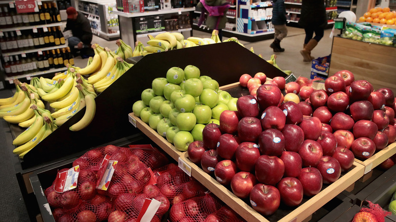
Unlike grocery stores that sell only groceries, many Target stores also offer home goods, office supplies, clothing, and other items. While not all Target stores are set up the exact same way, the grocery department is typically situated on one side of the store. There's usually a wide main aisle that runs perpendicular to the grocery aisles, and on the other side of the main aisle are inviting displays of non-food items.
Time says Target intentionally places items in strategic locations to encourage cross-buying. For example, when you enter through the grocery entrance of some locations, you'll find the grocery aisles on your left and the cosmetics aisles on your right. If the cosmetic section doesn't lure you in with the sample sizes, there will be plenty of other opportunities to be distracted by the time you get to the milk and dairy section.
Budgeting expert Andrea Woroch told GoBankingRates that "Shopping for groceries at Target often leads people to spend more than they planned, thanks to tempting product displays and sales on non-food merchandise." She adds that this design is intentional, so you'll be more likely to buy items on impulse.
Regardless of the reason that brings you to Target, chances are you'll end up leaving with more than you planned. This is all due to how the stores are strategically designed to appeal to your senses and encourage cross-buying.


