America's 15 Most Beautiful Home Kitchens Slideshow
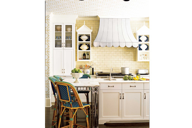
"'I wanted this kitchen to be fun and amusing,' designer John Oetgen says. 'The hood, done in hand-hammered zinc, is meant to look like a fabric canopy.' He flanked that 'canopy' with small Gothic-style cabinets. Then he added pale chartreuse tiles the color of olive oil, turn-of-the-century ironwork on the island, and stools that remind him of a French brasserie." — House Beautiful
Panel Comments:
"A kitchen that's truly warm at heart. The mix of patterns and textures create for visual interest." —Sabrina Soto, Sabrina Soto Home Design & Host of HGTV's The High Low Project
"[The] gothic cabinets, scallop hood, and use of wallpaper are so fun and unexpected!" —Julie Massucco, Massucco Warner Miller Interior Design and Decoration
"This is a great display of color and detail; the wallpaper on the ceiling, citron subway tile, and an interesting island leg design." —Benjamin Dhong, Benjamin Dhong Interiors
"The whimsy is great—range hood is fantastic! Wish I thought of that first!" —Michael Formica, Michael Formica Incorporated Interior Design and Decorative Arts Advisors
Details: Designer: John Oetgen, in collaboration with Sally Ann Sullivan. Stools: TK Collections. Zinc canopy and island ironwork: Calhoun Design and Metalworks. Subway tile: Renaissance Tile & Bath. Bamboo trellis wallpaper on ceiling: Cowtan & Tout.
#14 — House Beautiful / Sag Harbor, New York
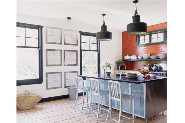
"Sometimes, all you need is one wall painted a vivid color. In this kitchen that spicy red warms up the space—the painted equivalent of a glowing fire on the hearth. Designer Amanda Kyser accentuated the strong horizontal lines of the headboard—which make the room feel wider—by adding a long shelf that spans the back wall. Vintage French factory lights provide bright task lighting and add another strong black accent." —House Beautiful
Panel Comments:
"The orange statement walls forms a bright focal point. The mix of styles in this kitchen give it its charm and charisma." —Sabrina Soto, Sabrina Soto Home Design & host of HGTV's The High Low Project
"A fun and friendly space with personality, kitchens need personality too!" —Campion Platt, Campion Platt Interiors
"Modern, clean, and fresh, but still warm and earthy." —Vicente Wolf, Vicente Wolf Associates Inc.
Details: Designer: Amanda Kyser. Paint is Benjamin Moore's Merlot Red on the back wall, White Dove on the other walls, and Onyx for the trim. Cabinets: Ikea. Range: JennAir. Faucet: Chicago Faucets. Barstools: Crate and Barrel.
#13 Southern Living / Hannibal, Missouri
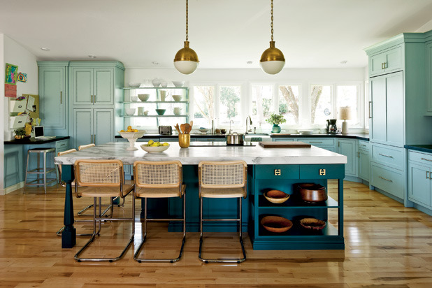
"Lynn and Bobby Boland, feeling a bit confined in the dated Hannibal, MO kitchen they share with their four children. Lynn and Bobby Boland wanted a complete overhaul. Without adding an inch of square footage, designer Amie Corley gave them the stylish, family-friendly kitchen they were hoping for. But, behind the kitchen's stylish front is a lot of thoughtful space planning and functionality. Lynn and Aime walled in an exterior door and shifted the eating area to the island to allow an impressive 285 cubic feet of cabinetry along the two walls. The new bright, airy space suits the busy realities of family life and still satisfies Lynn's style sensibilities." See more. —Southern Living
Panel Comments:
"Love the use of color!" —Lindsey Coral Harper, LCH Interiors
"Love love love! The cabinetry color and hardware made this outstanding! Love the mix of brass, wicker chairs, and see-through shelves by the windows." —Julie Massucco, Massucco Warner Miller Interior Design and Decoration
#12 Better Homes and Gardens / Atlanta , Georgia
"Designed as a retreat for a busy homeowner, this kitchen is a study in refined style. Cabinets are painted a linen-white and accented with flat-faced molding and linear stainless-steel pulls, combining traditional with modern accents. Metal and wood contrast against the planes of white — from the burnished-steel range hood to the custom island, crafted from chestnut. The kitchen sink is centered under a bank of windows framed in hand-forged iron, which provide pastoral views of the garden. The simple color scheme ensures the kitchen is elegant and a calming place to spend many hours." —Better Homes and Gardens
Panel Comments:
"A colorful, fresh, practical kitchen works as a gathering point for entertaining and is perfect for a busy family with its display wall for children's artwork and schedules. The accent color is fun and can be changed up seasonally, or, 'just because,' to keep it fresh." —Hilary Farr, Hilary Farr Design & co-host of HGTV's Love It or List It
"Clean, simple, and an easy feel with layers that add warmth." —Ginger Brewton, Ginger Brewton Interiors
"Steel windows, stainless island top, cool pendants, and simple white cabinets with bold hardware combine to make this a real winner. I love the styling with anchovy pots and pewter." —Jill Sharp Brinson, Jill Sharp Style
"Fantastic hood over the stove. The island adds interest since it's a piece of furniture. Love the architectural detailing and the steel windows." —Tobi Fairley, Tobi Fairley Interior Design
Details: Architect: Keith Summerour, Summerour Architects, summerour.net. Interior designer: Carter Kay, Carter Kay Interiors, carterkayinteriors.com. Kitchen designer: Cynthia Ziegler, Cynthia Ziegler, Inc., cynthiaziegler.com. Builder: Joe Noah, Noah & Associates, noahandassociates.com. Appliances: Range: Viking; Range Hood: custom, Calhoun Design & Metalworks, calhounmetalworks.com; Refrigerator, wine refrigerator: Sub-Zero.
#11 Country Living / Arizona
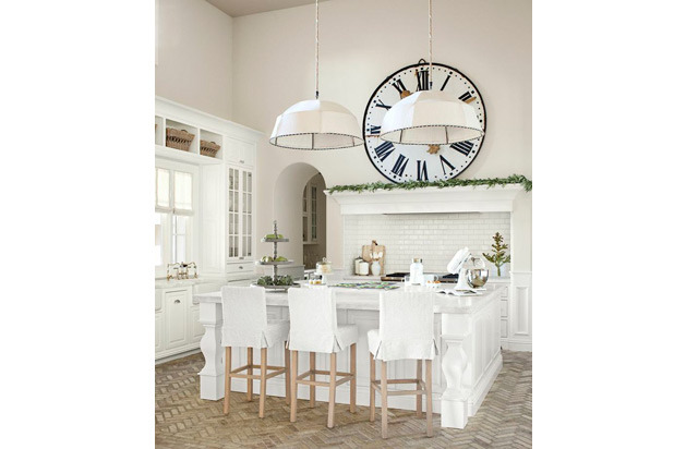
"In the Arizona kitchen of Bill Mueller, former player for the Boston Red Sox, and his wife, Amy, linen-covered pendant lamps bring the 17-foot ceilings down to a cozy scale. Amy bought the giant train-station clock on 1stdibs.com, then had the timepiece mounted to look as if it's casually propped above her Wolf range. White marble tops the custom cabinets and island. Amy worked with Phoenix architect Agnieszka Jastrzebska to devise a saltbox-meets-Southwest home, and designer Kirstin Alber to achieve a crisp look that can withstand the messiness of real life." See more. —Country Living
Panel Comments:
"Herringbone flooring makes me swoon! The over-scale enamel clock and stylish slipcovered stools make me want to sit and watch the cook. The white Bobo Intriguing Objects pendants are just perfect." —Jill Sharp Brinson, Jill Sharp Style
#10 Better Homes and Gardens / St. Paul, Minnesota
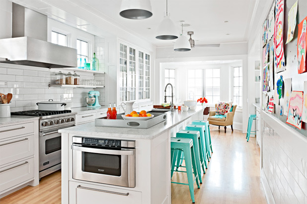
"A narrow foot print was maximized to create a cheery kitchen, perfect for family gatherings. White surfaces, from the subway tile backsplash to the simple white cabinets and Carrara marble countertops, tuck in alongside gleaming splashes of silver, from the cabinet hardware to the restaurant-worthy hood, range, and faucet. Windows on the range wall flood the space with light, but are high enough to prohibit a view into the neighbors' house. The long island provides plenty of space for food prep, cleanup, and seating. Outside the kitchen's work core, a bay window seating area and a kitchen desk create a multifunctional space designed with a family in mind." —Better Homes and Gardens
Panel Comments:
"A truly playful kitchen! The white acts as a canvas, allowing for color to pop!" —Sabrina Soto, Sabrina Soto Home Design & host of HGTV's The High Low Project
"Great use of a long/narrow space. The turquoise stools and kids art on the wall make this for me." —Julie Massucco, Massucco Warner Miller Interior Design and Decoration
Details: Architect: Todd Hansen AIA, CID Albertsson Hansen Architecture, LTD aharchitecture.com. Contractor: Harry Jensen Construction, harryjensenconstruction.com. Appliances: Range: Viking; Microwave Drawer: Sharp; Refrigerator: Jenn-Air; Hood: Straighline–Vent-a-Hood Co.
#9 Country Living / Sonoma, California
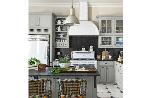
"Antiques dealer Sarah Anderson took measures to preserve things that, though not original to the 1875 Gothic Victorian building in Sonoma, CA, enhance its character—like a 1940s Wedgewood stove, left by previous owners. Sarah outfitted the existing stove with a custom hood; the new fridge exudes a similar vintage vibe. Offsetting those gleaming white appliances: dark soapstone counters and backsplashes, as well as ash cabinetry painted a muted gray-green." See more. —Country Living
Panel Comments:
"A truly beautiful kitchen reminiscent of life in America when there was an Ozzie and Harriet, and life was much simpler than it Is today. This kitchen is so warm and inviting, I can visualize the family gathered around the center." —Susan Zises Green, American Society of Interior Designers (ASID)
"A very smart looking kitchen. I love the light blue cabinetry combined with the dark blue counter tops along with the wicker chairs. Together it is all very elegant." —Alex Papachristidis, Alex Papachristidis Interiors
"I think the color play is wonderful, but the cabinetry is a tad overcomplicated. I love the use of vintage kitchen equipment, the overall effect is highly appealing." —Robin Bell, Robin Bell Design, Inc.
"Love the vintage elements and the proportions of the upper cabinets. Stunning palette and the texture of the bistro stools is perfect." —DD Allen, PIERCE ALLEN
"The mixed references of this kitchen are really interesting — incorporating old-school appliances, the stove and fridge, combined with the dark backsplash, cool stools, and great cabinet color make this a very original take on a kitchen for today." —Jill Sharp Brinson, Jill Sharp Style
#8 ELLE Decor / Millbrook, New York
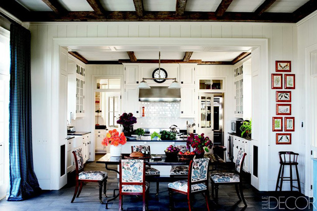
"In a Millbrook, NY home renovated by architect Gil Schafer and designed by Miles Redd, the cabinets are custom made, the vent hood is by Wolf, and the 19th-century chairs are upholstered in a Bennison fabric." See more. —ELLE Decor
Panel Comments:
"A beautiful country house kitchen with that Millbrook and Connecticut feel. I adore a white kitchen and with the mix of the furniture it's dressy-casual and wonderful." —Alex Papachristidis, Alex Papachristidis Interiors
"This is a perfect use of space, and terrifically edited design elements — oiled bronze cabinet hardware, slate counters. Kitchen is both inviting, functional, and polished." —Robin Bell, Robin Bell Design, Inc.
"Miles Redd can do no wrong." —Mary McDonald, Mary McDonald, Inc.
#7 VERANDA / Los Angeles, California
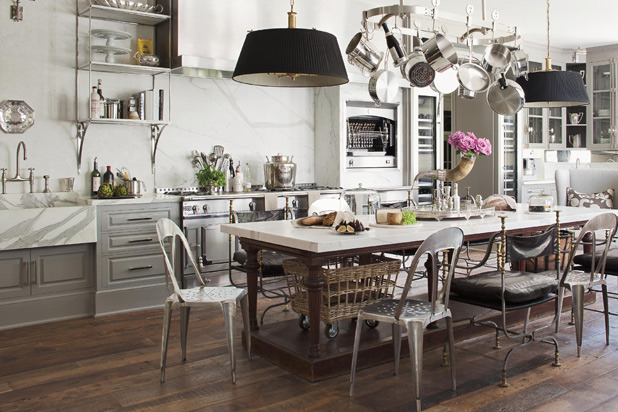
"Windsor Smith designed this large Los Angeles kitchen to be the true heart of the home, giving the entire family a relaxed and welcoming space to hang out in together throughout the day. It's one of our favorites for its charming balance of formal and casual pieces—luxurious and livable all at once." From Oct 2011 Issue (p. 134-135). —VERANDA
Panel Comments:
"I like the chic sophistication and comfortable lived-in quality." —Angie Hranowsky, Angie Hranowsky Interior Design
"Such a wonderful working kitchen. We love that she replaced the standard center island with a large sit down table." —Benjamin Dhong, Benjamin Dhong Interiors
"A modern functional kitchen within a tradition background." —Vicente Wolf, Vicente Wolf Associates Inc.
"Floating the table in the room which can serve SO many purposes is basically an invitation to be together from start to finish which I think is a wonderful vibe to create for your guests." —Shazalynn Cavin-Winfrey, SCW Interiors
Details: Designer: Windsor Smith.
#6 Better Homes and Gardens / Alys Beach, Florida
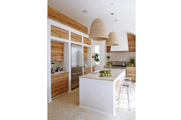
"The simplest of materials: wood, stone and plaster create a sleek and stunning kitchen in this Florida vacation home. Hand-scraped red gum cabinets, limestone countertop and Dominican shell-stone tile floors are the perfect balance of cool and warm in this elegant contemporary kitchen." —Better Homes and Gardens
Panel Comments:
"Dramatic juxtaposition of figured wood and plain plaster — modern but warm." —Marshall Watson, Marshall Watson Interiors
"A stylish modern kitchen with a Florida, Caribbean, Hamptons house feel. I love the woodwork and limestone — everything about it. It's very chic." —Alex Papachristidis, Alex Papachristidis Interiors
"I love the organic feel of wood and rattan with the clean lines and white plaster." —Angie Hranowsky, Angie Hranowsky Interior Design
"Makes me want to be there! I picture a beautiful view and a pool off of that kitchen!" —Ginger Brewton, Ginger Brewton Interiors
"There is something so appealing about the combined textures here that I admire — the woven IKEA pendants and the heavily grained cabinet fronts, mixed with the limestone floors and touches of stainless really make this space super cool." —Jill Sharp Brinson, Jill Sharp Style
"This is a risk taker in design. Orienting the largest appliance in the center of the wall, opposite the sink and counter to the range and hood is wonderful. What I especially love about this space is the bullnose surrounds to the cabinet niches. This is typically seen in plaster and takes a true artist to apply this technique in wall finishing." —Shazalynn Cavin-Winfrey, SCW Interiors
Details: Architect: Steve Mouzon, Mouzon Design, mouzon.com. Interior designer: Beth Dillard, Notre Maison Design Group, notremaisondesigngroup.com. Town architects: Marieanne Khoury-Vogt and Erik Vogt, AIA, CNU, P.O. Box 61-5500, Alys Beach, FL 32461; 850/213-5500. Appliances: Range, hood, microwave oven: Blanco; Washer, dryer: Bosch; Refrigerator: Sub-Zero; HVAC system: Daikin Industries.
#5 VERANDA / Atlanta, Georgia
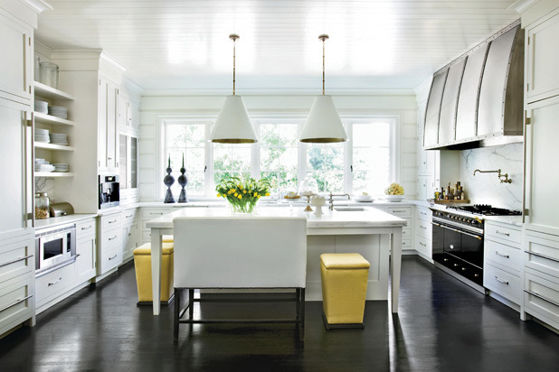
"We love this classic Atlanta kitchen by Melanie Turner, where contrasting elements create drama and depth: dark floors against brilliant white walls, both of which offset the subtly gold-veined marble counters and backsplash." From Sep 2010 Issue (p. 108-109). —VERANDA
Panel Comments:
"Great blend of texture and surfaces. The stainless steel counter on the oversized warm wood base table gives it a bit of an industrial feel in contrast with the sleek white cabinetry softened with wood countertops. The warm tone of the backsplash contrasts nicely with the stainless steel appliances. All finished off with the sleek, polished concrete floor. Functional, friendly space." —Hilary Farr, Hilary Farr Design & co-host of HGTV's Love It or List It
"Spectactular hood and reflective floor — clean and white." —Marshall Watson, Marshall Watson Interiors
"A dark floor and light kitchen create depth, contrast, and cimplicity. Pops of yellow give this kitchen character and friendliness." —Sabrina Soto, Sabrina Soto Home Design & host of HGTV's The High Low Project
"I love the tove and hood and the functionality along with the classic yet modern feeling of this kitchen." —Angie Hranowsky, Angie Hranowsky Interior Design
"A great mix of modern and traditional." —Lindsey Coral Harper, LCH Interiors
"The kitchen is simple yet had some drama. The hood is the showpiece and I love the painted bead ceiling. It's clean and fresh and classic." —Mick DeGiulio, de Giulio Kitchen Design
Details: Designer: Melanie Turner.
#4 VERANDA / Napa Valley, California
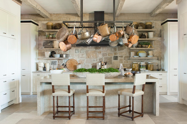
"This kitchen by Richard Hallberg is both gorgeous and ingenious. We're especially drawn to its seamless blend of rustic and modern elements—and cabinet doors that elegantly disguise refrigerators, ovens and wine storage." From Jan/Feb 2013 Issue (p. 76-77). —VERANDA
Panel Comments:
"This kitchen could be anyplace! The creative use of elements is so appealing and inviting — I wish it were mine!" —Susan Zises Green, American Society of Interior Designers (ASID)
"Warm palette of natural stone and beams. The cabinetry is nothing special, but the architectural shelves save the composition." —Marshall Watson, Marshall Watson Interiors
"This kitchen combines an efficient use of space and excellent use of materials. The stone wall provides an effective focal point — both warm and practical. Love the iron pot rack!" —Robin Bell, Robin Bell Design, Inc.
"Warm, cozy, inviting. The textures work so well together without feeling heavy or overdone." —Ginger Brewton, Ginger Brewton Interiors
"Rough and smooth! A very modern use of the new and old elements together. The combination of the rough limestone tile floor and stone counters is beautiful, and the limed wood beams are perfect with the palette. The simplicity of the cabinet design is timeless. Nice black metal accents." —DD Allen, PIERCE ALLEN
Details: Designer: Richard Hallberg.
#3 ELLE Decor / Mercer Island, Washington
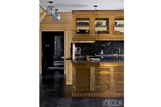
"In a 1946 cottage-style home on Washington's Mercer Island, designer Kelly Wearstler created a kitchen with cerused oak cabinetry, a brass island, marble countertops and custom-made light fixtures." See more. —ELLE Decor
Panel Comments:
"I really appreciate the visual creativeness of this kitchen, but there better be a really good staff to clean it! Those lovely round balls all over the center island are going to be real dust and grease collectors, if this is an active kitchen. However, it's so attractive, I just had to vote for it." —Susan Zises Green, American Society of Interior Designers (ASID)
"The brass details create an allure. Phenomenal details, while clean." —Brad Weesner, Brad Weesner Design
"Innovative expansion of the traditional vernacular. Richly employed materials — sumptuous but simple." —Marshall Watson, Marshall Watson Interiors
"This is a very unique kitchen. I love the gold, it makes it very interesting along with the dark stone and stylish woodwork. An unusual but very special kitchen." —Alex Papachristidis, Alex Papachristidis Interiors
"A great mix of old and new, modern and classical, and the skylights really help!" —Campion Platt, Campion Platt Interiors
"Elegant original use of materials. The wood tone with the brass is sophisticated and warm; a beautiful palette." —DD Allen, PIERCE ALLEN
#2 House Beautiful / Hermosa Beach, California
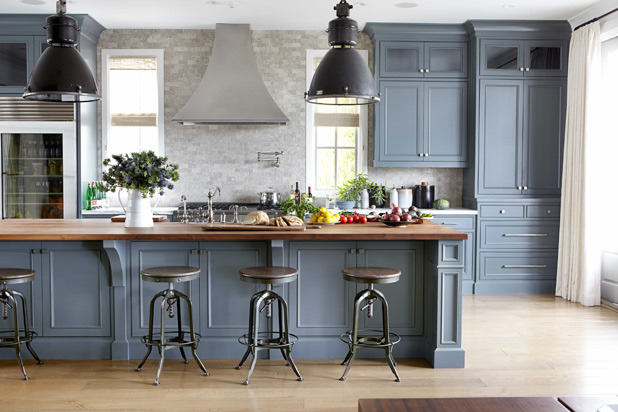
"The cabinets in this kitchen, designed by Parrish Chilcoat and Joe Lucas, with builder Matt Morris, are painted a warm gray; the island is done in a slightly cooler shade. The acid-washed limestone tiles and the custom stainless-steel hood and other appliances bring in more grays. That tone-on-tone idea creates depth and richness." —House Beautiful
Panel Comments:
"Tone on tone, smart design, fantastic lighting and the metal stools really give it an old Humphrey Bogart/old Hollywood feel, which of course, is timeless. Love the gorgeous wood counter top. Attention to detail is clearly evident." —Hilary Farr, Hilary Farr Design & co-host of HGTV's Love It or List It
"This kitchen really invites me in. It gives me the feeling that I want to be in it and actually cook. It looks warm, clean, organized — traditional, yet with a contemporary slant I just love it!" —Susan Zises Green, American Society of Interior Designers (ASID)
"Surprising blues and greys. Successful use of industrial accessories." —Marshall Watson, Marshall Watson Interiors
"Neutral and sophisticated, this kitchen creates an industrial yet warm feel. The wood softens the masculine look." —Sabrina Soto, Sabrina Soto Home Design & host of HGTV's The High Low Project
"Very calming, interesting, contrasting, and chic." —Campion Platt, Campion Platt Interiors
"Love the colors and room to move — very functional." —Ginger Brewton, Ginger Brewton Interiors
"The palette wins me over: beautiful shades of gray. The industrial stools and lights work really well and the warmth of the wood island counter is a great addition." —DD Allen, PIERCE ALLEN
Details: Designer: Joe Lucas. Paint on cabinets: Farrow & Ball's Down Pipe. Paint on island: Benjamin Moore's Chelsea Gray. Tiles: Classic Tile. Refrigerator: Sub-Zero. Faucet: Rohl. Hardware: Schaub and Company. Vintage industrial pendants: Paul Ferrante. Stools: Restoration Hardware. Custom hood by Matt Morris.
#1 ELLE Decor / Washington, District of Columbia
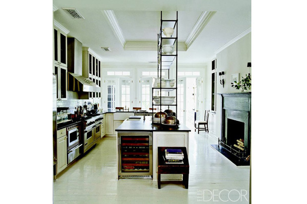
"In the kitchen of designer Darryl Carter's DC townhouse, the étagère is an Italian antique, the wine refrigerator is by Sub-Zero, and the range and hood are by Viking." See more. —ELLE Decor
Panel Comments:
"The proportions are perfect. The kitchen has a fresh and clean look, lots of interesting details without looking contrived. It functions like a chef's kitchen with all appliances neatly clustered along one area and two sinks." —Mich DeGiulio, de Giulio Kitchen Design
"Tall ceilings, open, airy spaces, a fireplace to create a feeling of warmth and contentment while you are cooking... just a fabulous kitchen." —Susan Zises Green, American Society of Interior Designers (ASID)
"Long sight lines, open yet contains functionality. 'Cook side' and 'server side' works for catering when necessary." —Brad Weesner, Brad Weesner Design
"Love the sense of space. A clean elegant kitchen. Classic with a modern feel." —Alex Papachristidis, Alex Papachristidis Interiors
"Great soaring height, a dramatic room with old, new, contrast, and refreshingly open area." —Campion Platt, Campion Platt Interiors
"Perfect use of space and materials, both great looking and functional, placing the kitchen at the core of the living space without compromising light — the étagère on the counter is brilliant." —Robin Bell, Robin Bell Design, Inc.
"Always a classic and never overdone. I picture Darryl cooking while friends hang out and drink wine." —Ginger Brewton, Ginger Brewton Interiors
"The use of étagère is so original, a great idea! Love the painted wood floor and the fireplace." —DD Allen, PIERCE ALLEN
"Simply the most inspiring and awesome kitchen — the steel detail on the island is a constant source of inspiration. The setting with the fireplace, the styling of the kitchen — all of it is amazing!" —Jill Sharp Brinson, Jill Sharp Style
