These Early Logos Of 5 Popular Fast Food Chains Are Hilariously Awful
Everyone looks a bit awkward during their formative years. And just like gawky teenagers, the early looks that fast food chains showed to the world are probably something that these chains would rather nobody ever saw. Here are early logos from some of America's biggest fast food chains.
McDonald’sMcDonald’sRonald look like the best mascot of all time
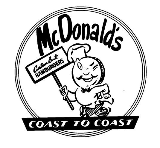
From 1953 to 1962, mascot was a man with a hamburger for a head named Speedie. Makes .
Burger Kinghis modern counterpart
The original Burger King (in use from 1957 to 1969) wasn't quite as creepy as in those "Wake up with the King" commercials, but those shoes can still do some serious damage.
Sonic logo from 1963
Space-age and hokey at the same time, this features a guy carrying, by our estimate, about 30 burgers.
Hardee’s
This early Hardee's logo is from 1962, two years after its founding, and features a chef standing over a tiny grill, holding two impossible-to-discern objects.
Rally’s
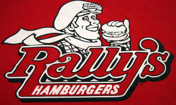
This logo from 1985 features a fellow in old-timey racing gear eating a burger with his pinky out. Does anybody really associate Rally's with eating a burger with your pinky out? Or with racing, for that matter?