Dialing Up The Details: Themed Menu Cards
Every month, I create a highly curated dinner for 16 strangers on my back deck. Of all the important parts of the evening, you will often hear me say the most crucial are the tiny details.
In my "other" life, I run a non-traditional marketing company that helps giant brands hone their customer experience. When you walk into an Apple store, you feel a certain sense of exhilaration. This is not an accident—on the contrary, it is quite purposeful. Had I caught you on your way out of the store, you probably wouldn't be able to identify the small details that produced that amazing feeling. I will argue, had those details been missing, so would the memory of a great experience.

Dinner parties can learn a thing or two from the above scenario. I pour over the smallest details for my gatherings. From the sign identifying the bathroom to the menu, everything fits the theme. For the purposes of this post, let's focus in on the menu.
Traditionally, a place card is used on tables for big dinner parties and holidays. I think it should be more functional then to simply mark "who sits where". Giving your guests a taste of what's to come is far more interesting to them than their name. I like to give each guest a menu to whet their appetites, and create suspense for what's to come. I also like for it to tie in with the theme.
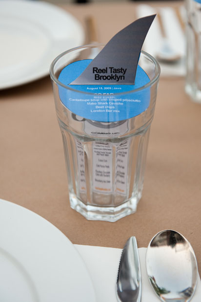
For example, when I hosted a dinner screening the movie JAWS, I created this menu card that brought the food and the movie together in one simple image—a fin coming out of the water—that fit right inside each guest's water glass.
I thought I would be fun to share a simple way to do the same for your upcoming Thanksgiving feast.
 Like 'em? Download the file and create your own for this year's feast.