The Science Behind How Your Kitchen's Color Can Affect Your Appetite
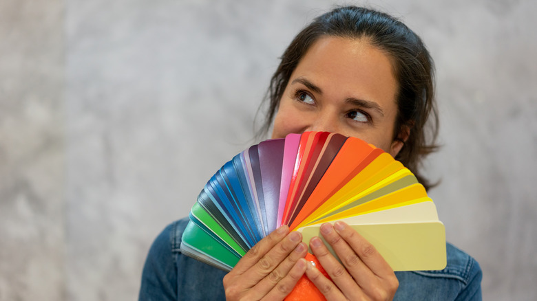
The color scheme of your kitchen can significantly impact your appetite and eating habits, thanks to the fascinating science of color psychology. Color psychology is the study of how colors affect human behavior, emotions, and perceptions, including appetite. This field suggests that colors can evoke specific emotions and influence people's perceptions of spaces, objects, and brands.
Warm tones like red, orange, and yellow are known to stimulate the appetite and promote feelings of excitement and energy. On the other hand, cool tones such as blues and darker greens can have a calming effect that may suppress the appetite. Incorporating these hues in your kitchen may be helpful for those aiming to maintain portion control, but too much blue can actually decrease overall appetite, so it's better to strike a balance between calming and stimulating colors.
Understanding the psychological impact of color in your kitchen design can help create an environment that simultaneously enhances your eating experience and promotes healthy habits. Color can be incorporated into kitchen decor through accent walls, lighting, cabinetry, decorative accessories, utensils, or appliances like ovens or refrigerators.
Your brain on color
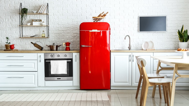
The way the brain responds to color and how that, in turn, impacts hunger is an intricate process. It's all mediated by the brain's response to visual stimuli and the subsequent release of neurotransmitters like dopamine and serotonin. Red plays on our primal instincts because it is a hue commonly found in nature, especially in meat and fruit. Seeing the color red triggers a biological response in the body where the heart rate and blood pressure increase. This heightened state can invigorate the metabolism and signal hunger and is why many fast food restaurants are red.
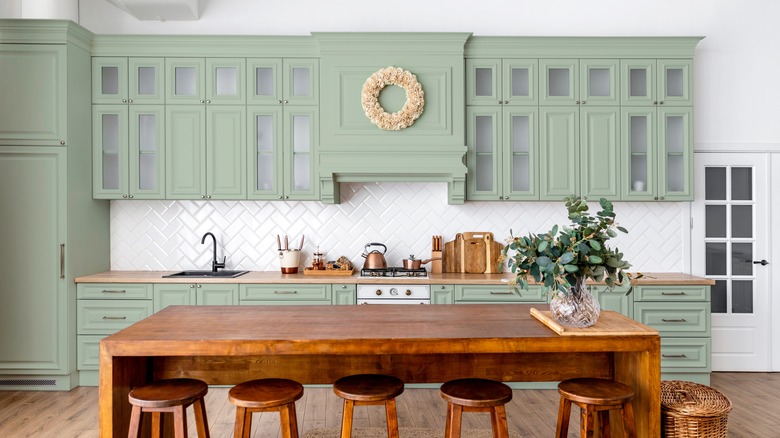
Cooler colors like blues or purples have been shown to have a calming effect on the brain, reducing feelings of hunger. That's because these colors are not commonly found in whole foods from nature, whereas warmer colors like red, orange, and yellow are prevalent in many fruits and vegetables. This stems from the brain's primal reaction to blue, purple, or even black foods. The brain perceives these colors as being associated with spoiled or rotten food, and therefore suppresses the appetite.
How to incorporate color into your kitchen design
Regardless of how they affect appetite, incorporating colors into your kitchen design is a great way to enhance its aesthetic appeal. But you will want to pay attention to the psychological impact, too.
Because the warmer reds, oranges, and yellows are known to increase energy levels, it's best to incorporate these colors sparingly through elements like accent walls, backsplashes, or kitchen accessories. Use them in moderation to avoid overwhelming the space. Consider an appliance in a bold statement color and keep the rest of the room generally neutral.
The cooler and calmer blues, greens, and purples are best used in areas where you want to promote relaxation, such as dining areas or breakfast nooks. Incorporating natural elements like plants or herbs in shades of green can also add some variety visually while enhancing the calming atmosphere.
Pay attention to tone, too. "It's not just your color choice that will affect the atmosphere you create in your kitchen: The tone of the color will have an effect too," Ruth Mottershead, creative director at Little Greene Paint & Paper, told Homes & Gardens. "Bright and bold green will create a vibrant and energetic feel, while a muted and more gentle tone will create a calming environment that is well suited to open plan living."