Why Arby's Changed (And Ultimately Brought Back) Its Logo
Arby's has been around for years. Founded in 1964 as a way to sell roast beef restaurants to a higher clientele, the restaurant chain has weathered many ups and downs, highs and lows over many decades; today, the company is one of the most recognizable symbols of the modern fast-food industry.
Of course, when you've been around for as long as Arby's has, you have to undergo some changes. Sometimes it may be a change to your menu, and other times it may just be a simple cosmetic change, like updating your branding to match with the times. In 2012, Arby's announced that it would be changing its logo. This wasn't something the chain had done on a whim, considering the last time Arby's had changed its logo was all the way back in 1975. The time was ripe for it too, as the announcement was not only relatively early into the new decade, but it was also around the time Arby's was nearing its 50-year milestone in 2014. Not only would a new logo reflect a new decade, but it would also celebrate a milestone in the company's history.
And so, in 2012, Arby's updated its logo. This one would be bolder, sleeker, and most importantly, in computer-generated 3D. What better way to show off your company is moving to the future than with cutting-edge graphics? Unfortunately, the public at large did not like the new, "futuristic" logo.
People thought the new logo looked sterile
With any "new" thing there's bound to be people who just plain don't like it. Whether it's a new thing entirely or a change to an old product or image, everyone will have their own opinions — and that's perfectly understandable. But, in the case of Arby's new logo in 2012, it seemed like the majority of people weren't exactly thrilled with the change.
Unlike the previous logo, which was flat, a light shade of red, and had a hand-drawn appearance, the new logo was a darker shade of red, featured geometric lettering, and had a glossy 3D appearance. It resembled something out of early computer animation, paired alongside what was going to be Arby's newest slogan: "Slicing Up Freshness."
Many had criticisms regarding the new logo. Some believed that the new logo lacked the original spirit of Arby's, with the modern design contrasting against the simple concept that made Arby's work. Others argued that the 3D style made the logo lack "cohesion," or that the bright glossy effect and CGI aesthetic made the new logo look "sterile" rather than modern or appealing. One critic, discussing the logo in Bloomberg, even called it "forced." In short, many found Arby's redesigned logo unappealing and an example of a company messing with something that didn't need improving on in the first place.
Arby's knew what it had to do. If it wanted people to change their tune, they would have to quite literally go back to basics.
Arby's went back to its classic logo
Arby's may have sound reasoning when it came to developing their new logo, but in the end, people were much more comfortable with the old one. Arby's had no choice but to bring back its classic logo — not even a year following the introduction of its new one.
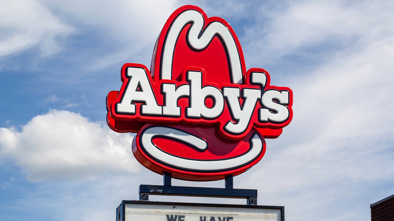
Arby's "new" logo, or the one that would replace its 2012 logo and the one we're all familiar with, looks remarkably similar to its previous pre-2012 logo. It retains the hand-drawn style of the old logo, but compresses it to a much more compact style. While the famous cowboy hat isn't as big as it used to be, and the letters are much blockier than before, the new logo seemed to be a welcome change compared to the bold 3D image Arby's previously had.
Oddly enough, a very similar incident happened involving the clothing retail giant GAP. In 2010, the company changed its classic logo into something more "hip" — changing the famous blue square logo into a trendy, minimalist style. The end result was instant outrage, with many calling the change unnecessary and pointless — in fact, so great was the outcry that the company changed its logo back to the original one in only six days. In the end, GAP had lost millions of dollars in marketing and had earned the ridicule of many.
While Arby's and GAP have little in common, it seems logo design changes make for strange bedfellows.


